Custom
Typing Structure ⌨️
- To start the Test First need to select the Timer and the words as You like then you can start typing.
- Correctly typed words are locked permanently and cannot be edited again.
- Skipping a word is allowed only after typing at least one character in the current word.
- If letters are missed or skipped, BACKSPACE can be used unless a correct word was typed after it.
- SPACEBAR moves you to the next word and marks remaining letters as skipped.
How It Works ?
- Correct letters turn white, showing a match with the paragraph. Wrong letters turn red to clearly indicate mistakes.
- The test ends only when time finishes or when the final letter of the last word is typed correctly.
- Restart generates a fresh paragraph and resets all stats and timers.
- Cursor automatically follows the typing flow
- Extra letters are added only at the end of a word. Extra input elsewhere is marked as incorrect.
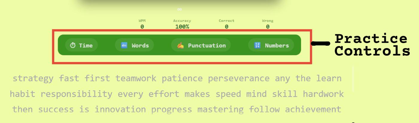
Controls (Time, Words,Punctuation & numbers) 🎛️
- Select a fixed duration or set a custom time (up to 7200 seconds).
- Any keyword is pressed will lead to start of typing with default of 60 sec time.
- Choose word count easily from the dropdown or use custom input.
- Enable punctuation to include symbols in the paragraph.
- Enable numbers to practice typing digits naturally.
Control Behavior 🎛️
- Time or word changes regenerate a fresh paragraph instantly.
- while typing you can selects the time and words the paragraph will be reset.
- Punctuation improves real-world accuracy and focus.
- Numbers train smooth numeric typing without breaking flow.
- All controls are session-based and reset on restart.
- Combine time and words for balanced speed practice.
Live Stats
ACCURACY & ERRORS 🎯:-
- Accuracy drops instantly on mistakes
- Fixing errors does not fully recover accuracy
- Skipped characters are treated as errors
- Overtyping lowers accuracy score
- Consistent accuracy improves long-term speed
WPM 📈 & SPEED BEHAVIOR 🚀 :-
- WPM is calculated using correct characters only
- Raw WPM ignores accuracy penalties
- Speed fluctuates based on recent keystrokes
- Pauses can reduce effective WPM
- Stable typing improves average WPM
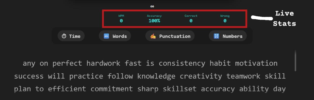 Live stats panel
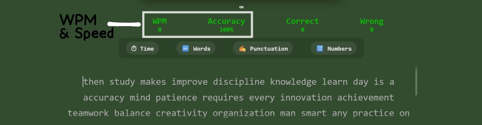 WPM & speed panel
GENERAL GUIDANCE 💡:-
- Live stats update with every keystroke
- Correct typing increases overall accuracy
- Wrong or skipped letters reduce accuracy
- Extra letters are counted as mistakes
- Backspaces affect typing rhythm
Common Typing Mistakes ⚠️
- Lack of focus increases repeated errors
- Extra keystrokes create overtyping mistakes
- Frequent backspacing disrupts typing flow
- Skipping letters breaks word accuracy
- Typing too fast without control causes errors
- Ignoring finger placement
- Pausing too often while typing
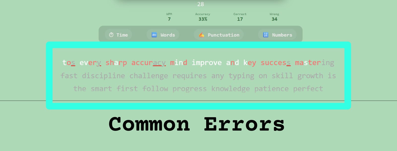 Frequent typing mistakes
Typing Strategy 🎯
- Start slow and focus on accuracy first
- Accept small errors and keep typing
- Maintain a steady typing rhythm
- Use SPACEBAR only after finishing a word
- Track stats to improve each session
- Practice finger discipline consistently
test complete
About Your Last Sessions
- Session Storage: Only the last 3 typing sessions are saved. Each new test becomes the most recent session, and when a fourth test is taken, the oldest session is removed. This keeps your progress focused on recent performance.
- Purpose of Session History: Session history allows you to compare attempts, identify patterns, and track gradual improvement instead of relying on a single score.
Session Metrics Explained
- WPM (Words Per Minute): Measures typing speed based on standard word length. High WPM is useful only when combined with good accuracy.
- Accuracy: Shows how correctly you typed the reference text. It is affected by wrong letters, skipped characters, and extra inputs.
- Correct Characters: Represents the number of characters typed exactly as expected. A steady increase across sessions indicates improved control.
- Wrong Characters: Occur when incorrect letters are typed. These often indicate weak key familiarity or rushing.
- Skipped Characters: Appear when letters or words are missed entirely. Skipping reduces real typing quality and lowers accuracy.
- Extra Characters: Additional letters typed that do not exist in the reference text. These usually occur when typing rhythm breaks.
- Time Taken: Shows how long you actively typed during the test. Comparing time across sessions reveals hesitation or pauses.
How to Use Session Data Effectively
- Compare your most recent session with previous ones to observe trends instead of isolated results.
- Focus on reducing skipped and extra characters before trying to increase speed.
- Small, consistent improvements matter more than one unusually high score.
Reference Text & Your Typing
-
Reference Text
The reference text is the original paragraph provided for the typing test. It acts as the accuracy benchmark and remains unchanged during the session. Every character you type is compared directly against this text to calculate correctness. Practicing with reference text helps build consistency and muscle memory. -
Your Typed Text
This section displays exactly what you typed during the test, including all mistakes. Correct characters, skipped inputs, extra keystrokes, and wrong letters are preserved. Seeing raw input instead of corrected text helps you understand real typing behavior. This transparency is essential for meaningful improvement. -
Why Comparing Both Matters
Comparing reference text with your typed text reveals where errors actually occur. It helps identify whether mistakes are random or repeatedly happening on the same keys. This comparison also highlights timing issues such as rushing or hesitation. Without comparison, improvement becomes guesswork instead of a measurable process.
Learning From Typing Mistakes
-
Understanding Error Patterns
Mistakes often follow patterns rather than happening randomly. Repeated errors on certain keys suggest finger placement issues. Skipped characters may indicate rushing or lack of focus. Extra characters usually occur when control is lost during speed bursts. -
Progress Through Awareness
Improvement begins by becoming aware of your own typing habits. Watching how mistakes appear helps you consciously slow down when needed. Accuracy naturally improves once error awareness increases. Speed should always follow accuracy, not the other way around.
Legend Color Indicators
-
Green – Correct Characters
Green highlights indicate characters typed exactly as expected. These show proper finger placement and rhythm. A higher number of green characters reflects strong typing fundamentals. Consistency in green output is a key sign of improvement. -
Red – Incorrect Characters
Red highlights mark characters that do not match the reference text. These errors often happen due to similar-looking keys or rushed input. Tracking red errors helps identify weak letter combinations. Reducing these directly improves accuracy percentage. -
Yellow – Skipped Characters
Yellow indicates characters that were missed entirely. Skips usually occur when typing speed exceeds control. They suggest the need to slow down slightly for better accuracy. Eliminating skips stabilizes overall performance. -
Blue – Extra Characters
Blue highlights represent additional characters typed unnecessarily. These often appear during loss of rhythm or overcorrection. Extra characters increase error count even if speed is high. Learning to maintain flow helps reduce these mistakes.
Result Action Buttons
-
Repeat Test
The repeat test option allows you to retry the same paragraph instantly. This helps apply lessons learned from previous mistakes immediately. Repeating the same text builds familiarity and confidence. It is one of the fastest ways to improve accuracy. -
Retry / Reset
The retry option resets the typing environment completely. It prepares the system for a fresh session without previous influence. This is useful when switching focus from speed to accuracy. A clean restart often improves concentration.
Understanding the Result Graph
The Result Graph provides a visual timeline of your typing performance throughout the test. Instead of reducing your effort to a single final number, it captures how your speed evolved from start to finish.
This graph helps you understand whether your typing was stable, rushed, or inconsistent. A smooth and balanced curve usually indicates strong control, while frequent spikes and drops may point to hesitation or excessive correction.
Each dip in the graph often corresponds to moments where your focus broke, difficult words appeared, or errors required correction. These drops are not failures — they are valuable indicators of where improvement is needed.
One of the most important lessons from the Result Graph is pacing. Many typists start too fast and lose speed midway. Others warm up slowly and peak later. Identifying your natural pattern helps you adopt a more efficient strategy.
When comparing multiple test sessions, the graph becomes a powerful progress tracker. Over time, improvement is reflected not by higher peaks, but by smoother curves and fewer sudden drops.
Using the Repeat Test option allows you to practice the same content again while observing changes in graph stability. A more controlled graph on the same text is a strong sign of real improvement.
The Retry option introduces new text and challenges adaptability. As your skill grows, even unfamiliar content should produce cleaner and more balanced graphs.
Ultimately, the Result Graph shifts your focus from chasing speed to building consistency. Mastery in typing comes from control, rhythm, and endurance — all of which are clearly reflected in this visual feedback.